Did you know that effective travel web design is quite different than web design for most other industries? The travel and tourism industry is a huge piece of the worldwide economic pie. In fact, it accounted for $7.6 trillion in 2016 alone.
What that means to your travel website is a lot of opportunities and a lot of competition.
Can you believe that the average traveler checks out 38 different websites before deciding on their next vacation?
That means your site needs to stand out from the crowd.
In this article, we’ll take a look at 4 travel web design secrets that’ll help you book more customers.
How to Use Content Blocks
Content blocks are a flexible way to display all kinds of information on a user’s screen while giving each tidbit of information its own area and identity.
The Florence walking tour website is a great example of this.
Content blocks can:
- Contain text
- Contain images
- Have a combination of images and text
- Be used in interactive contact forms
- Include animations or rollover effects causing color changes, callouts, and text and image changes
- Be presented to the user as a basic grid or collage style grid
Each option gives the user a different experience that’s interactive and fun.
Use Subdued Fonts and Colors
The colors and fonts you use are the basic design elements that will affect the weight of the interface for the user.
Travel sites often become very cluttered with words and images, especially when showcasing options like accommodations, activities, and business class flights. You’re trying to get as much information out there as you can.
By choosing a monochrome design or using muted and subdued fonts and colors, you’ll “soften up” a cluttered user experience.
This makes content such as activity guides easier to browse and your main call-to-action buttons stand out. This is especially true when you contrast your calls-to-action in a bold color like red.
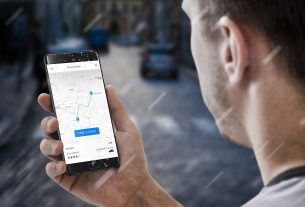
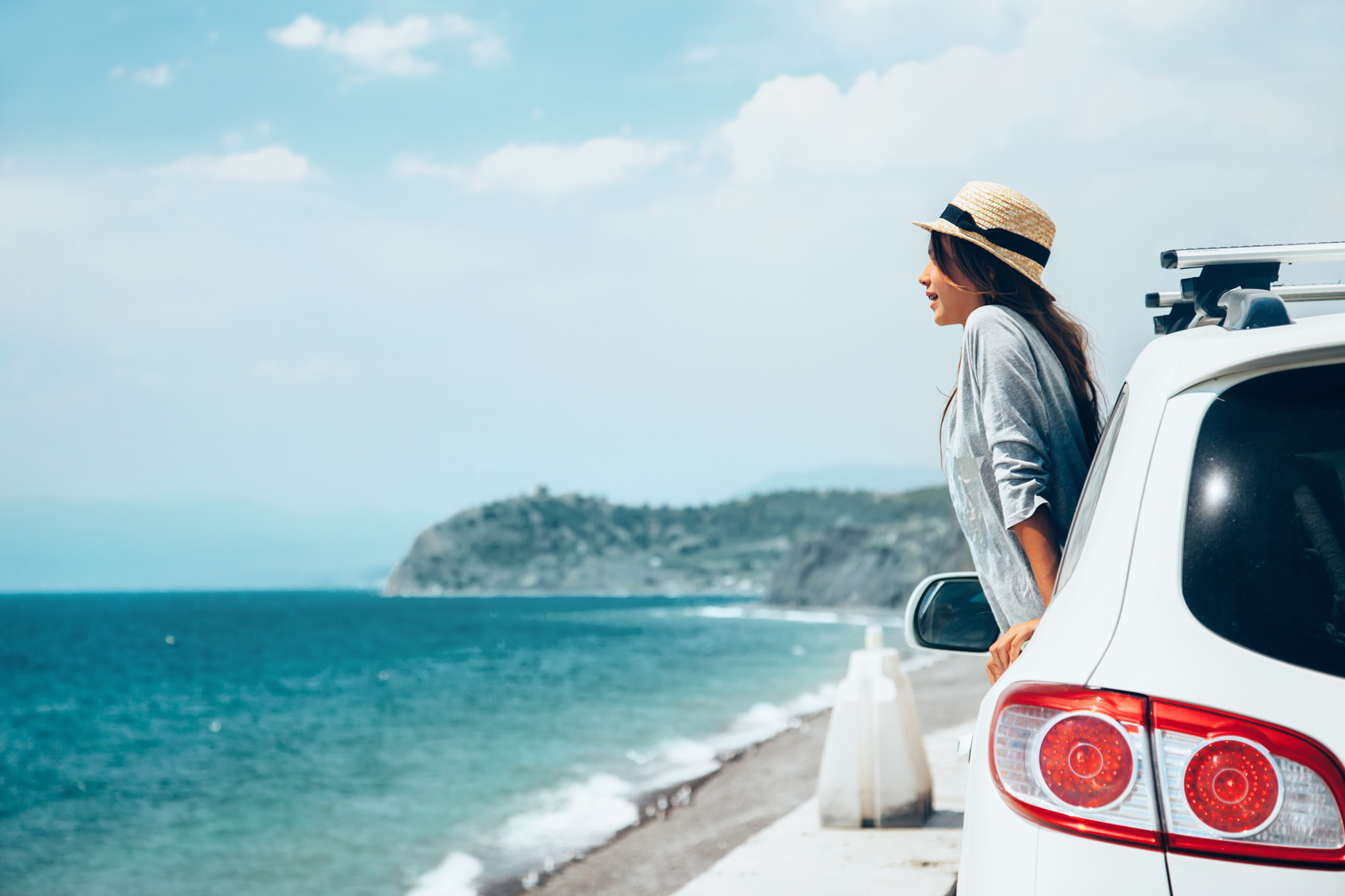
Full-Screen Images Are Worth More Than a Thousand Words
Are you going to buy music without hearing it first? Would you spend hard-earned money on food you’ve never tasted?
This is no different in the travel industry.
Big, robust images are an absolutely essential ingredient in travel web design. If you want your user to book with you, they’re going to want a powerful visual experience on your website.
Give it to them.
Big images entice travelers and get them excited about a potential trip. They can also be a powerful storytelling tool.
Use less text and more images on the interface. Carefully select the images you want to use.
It’ll make for a much more effective user experience.
Transparencies Create Layers
When you use transparencies, you can tackle several needs at the same time.
First, users can see through different layers of content. It creates a layering effect that builds anticipation of what they’ll see when they’re with you in person.
You can also use transparencies as rollover effects. There are many ways to do this that can be incorporated into your design.
Transparencies can also help to soften up images and lend refinement to otherwise dull images.
Travel Web Design That Works
It’s important to remember that a travel website is nothing like a website that sells widgets. You’re selling a visual experience.
Once your website is designed and rolled out, it’s also important to remember to get reliable website monitoring.
It’ll keep you abreast of any downtimes that could cost you business.
We hope you’ll make use of this design information, and we’ll see you soon!